
The reporting module displays interactive report widgets. You can arrange widgets into a two-column dashboard and reorder them via drag-and-drop.
In this guide, you will learn how to:
Arrange your Reports dashboard (drag, drop, reorder)
Use the global date range and compare periods
Export data and visuals from any report
Apply report filters, change chart types, and save report views.
Manage reports (add, remove, and reorder)
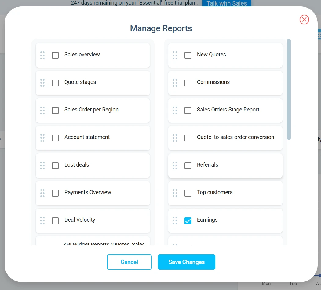
Click the plus (+) icon on the right side of your screen.
Select Manage Reports to open the window.
In this window, choose which reports you want to display.
Drag and drop reports to reorder them.
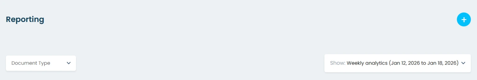
Set a global date range (applies to all reports)
Click on the date field on the right of the screen
Choose one option:
Weekly, Monthly, Quarterly, Semi-Annually, Annually, or Custom Date Range
Review multiple reports with the same time context
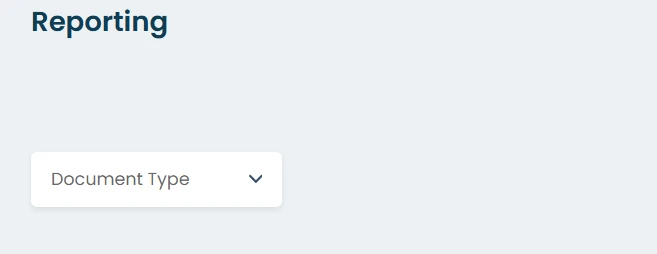
Display same document type on all reports
You can set a global document type for all reports. This lets you choose one document type (for example, Quotes) and have every report display only that data by default.
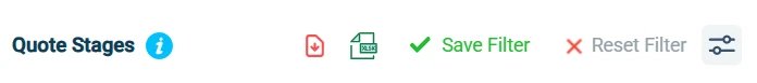
Export your report (data or chart)
Download raw data (table export)
Export report data (Excel)
Open any report widget.
Click the Excel icon to download and export the dataset used to generate the chart.
Export the chart (PDF)
Open any report widget.
Click the red Download icon to export the chart as a PDF.
Filter and change how the report is displayed
Apply report-specific filters
Click on the report filter icon
Use the report’s filters to refine the data (examples include category/subcategory, item, document type, region, tags).
Click Apply Filter
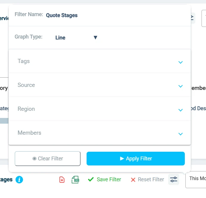
Change the chart type
In the report filters, switch the graph type to match what you need:
Bar, Stacked Bar, Line (Wave), Pie, Table
Save report views
Apply your filters and select a graph type.
Click Apply Filter.
Click Save Filter and enter a name.
Your saved filter will appear in the list of available filters.
Use a saved filter
Click a saved filter to apply it and view the report using that view.
Click it again to return to the unfiltered report, or select a different saved filter.

Reports
This is the full list of reports available in Osmos. Depending on your plan and which modules you have enabled, some reports may not be available or may show no data. Reports update in real time as you create quotes, sales orders, invoices, payments, leads, and deals.
Sales Overview
What it’s for: A high-level view of quotes, sales orders, and invoices with breakdowns by product, team, region, tags, document type, and sources.
What you’ll see
X-axis: time period (day/week/month/quarter/year)
Y-axis: dollar value ($)
Filters
Document Type, Category, Subcategory, Item, Member, Source, Region, Tags
Graph types
Progress Bar, Stacked Bar, Wave, Pie, Table
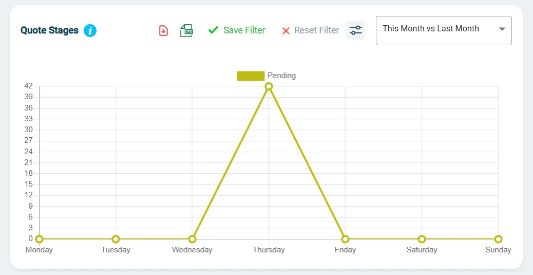
Quote Stages Report
What it’s for: Track how quotes move through your quote stages to spot bottlenecks and improve follow-up timing.
What you’ll see
X-axis: time period + quote stage
Y-axis: number of quotes (count)
Filters + graph types
Member, Source, Tags, Region
Stacked Bar, Progress Bar, Pie, Line
Quote-to–Sales-Order Conversion (Quote Overview)
What it’s for: Compare how many quotes (and how much value) convert into sales orders, including conversion rate.
What it displays
X-axis: Time period
Y-axis: Toggle between Value ($) or Quantity
Side-by-side or overlaid values for:
Quotes vs. Sales Orders
Conversion Rate (%)
Filters
Member, Source, Tags, Region (billing country)
Y-axis toggle
Graph types
Bar
Stacked Bar
Wave
Progress Bar
Sales per Region Report
What it’s for: A world map view of quote/order/invoice activity to see where revenue and activity come from.
What it displays
World map
Total value ($) and number of documents (Quotes, Sales Orders, or Invoices)
Filters
Document Type: Quote, Sales Order, Invoice
Category/Subcategory, Item
Source, Tags, Member, Region
Graph type
World Map only (zoom and pan enabled)
Sales Orders Stage Report
What it’s for: Track sales orders by status (Created or Voided).
What it displays
X-axis: Time period
Y-axis: Toggle between count or total value ($)
Filters
Category/Subcategory, Item
Member, Source
Region (billing country)
Tags (from sales orders or contacts)
Y-axis toggle
Graph types
Stacked Bar
Pie
Sales Team Overview Report
What it’s for: Compare sales performance by team member (sales), deal size trends, commissions, and trends over time (based on quotes/orders/invoices).
What it displays
X-axis: Time
Y-axis: Value ($)
Filters
Document Type: Quote, Sales Order, Invoice
Category/Subcategory, Item
Source, Region, Tags
Performance metrics
Graph types
Bar
Wave
Stacked Bar
Table
Top Customer Report
What it’s for: Rank your best customers by value, purchase count, and relationship length to focus on key accounts.
What it displays
X-axis: Time
Y-axis: Toggle between value ($) or purchase count (based on sales orders)
Filters
Category/Subcategory, Item
Source, Region, Tags, Member
Document Type (Quote stage, Sales Order, Invoice)
Y-axis toggle
Top N: 10 / 20 / 30 / 40 / 50 contacts
Graph types
Bar
Stacked Bar
Wave
Table
KPI Widget Reports (Quotes, Sales Orders, Invoices)
What it’s for: Quick “this period vs. last period” trend widgets.
Widget: Quotes Trend
Displays:
Total quotes (current period)
% change vs. previous period
Previous period total
Widget: Sales Orders Trend
Displays:
Total sales orders (current period)
% change vs. previous period
Previous period total
Widget: Invoices Trend
Displays:
Total invoices (current period)
% change vs. previous period
Previous period total
Payments Overview Widget
What it’s for: Snapshot of payments received, due, and past due, compared to the prior period.
Displays:
Payments Received (current period + % change + last period value)
Payments Due (open invoices due today or later)
Payments Past Due (unpaid invoices with due date before today)
Sales Forecast
What it’s for: Forecast future revenue using historical trends (moving averages / seasonal patterns).
What it displays
Historical-based forecast (last 6 or 12 months)
Predicted totals for next month/quarter
Trend lines
Filters
Member
Category/Subcategory
Source, Tags, Region
Graph types
Wave
Bar
Deals Forecast
What it’s for: Forecast pipeline revenue from open CRM deals, weighted by stage probability and expected close dates (uses historical win rates).
What it displays
Historical win-rate forecast (by deal type/rep/segment)
Projected close likelihood
Filters
Deal Value
Member, Deal Stage
Region, Tags, Deal Type, Source
Graph types
Wave
Bar
Deal Velocity Report
What it’s for: Measure how long deals take to move through stages and where they get stuck.
What it displays
Average time per stage
Total time: created → closed (won/lost)
Stage-by-stage trend view
Filters
Member, Deal Type, Deal Stage
Region, Tags, Source
Graph types
Bar
Stacked
Table
Lost Deals Report
What it’s for: Review deals marked as lost (rep, reason, value, timeline) to improve coaching, qualification, and pricing decisions.
Filters
Member, Deal Type, Deal Stage, Deal Value
Tags
Reason Lost (multi-select)
Graph types
Pie
Progress Bar
Wave
Table
New Leads Report
What it’s for: Track new leads over time, sources, reps, regions, and tags.
What it displays
X-axis: Time
Y-axis: Number of new leads (or value — toggle)
Filters
Member
Deal type
Deal stage
Source
Tag
Y-axis toggle
Graph types
Table (member/region/source/quantity)
Line
Stacked Bar
Pie/Donut
KPI tiles (this period vs. last period)
Tabular export columns
Contact, Member, Date Created, Region, Source, Tags
Current Status, Days Since Created, Last Activity Date
New Quotes Report
What it’s for: Track new quotes created over time and break them down by rep, region, source, tags, stage, and interactions.
What it displays
X-axis: Time
Y-axis: Number of new quotes (or value — toggle)
Filters
Member, Region, Source, Tags
Stage, Interactions
Y-axis toggle
Graph types
Wave
Stacked Bar
Pie
Table
Quote Stage Trend Report
What it’s for: Track the count or value of quotes in one specific stage over time (example: Viewed, Won, Expired).
What it displays
X-axis: Time
Y-axis: Number of quotes or total value
Filters
Stage
Member, Region, Tags, Source
Graph types
Line
Stacked Bar
Progress Bar
Pie
Won Deals by Source Report
What it’s for: See which sources generate the most won deals (volume).
What it displays
X-axis: Time
Y-axis: Number of won deals
Filters
Member, Tags, Deal Type, Deal Stage
Graph types
Bar
Progress Bar
Table
Quotes by Source Report
What it’s for: Track how many quotes come from each source, optionally with value and outcomes.
What it displays
X-axis: Time
Y-axis: Number of quotes
Filters
Member, Region
Quote Status, Document Type
Tags, Category/Subcategory
Source
Graph types
Table
Stacked Bar
Progress Bar
Bar
Pie
Quote-to-Cash KPI Summary Widget
What it’s for: A compact KPI row summarizing the full flow from quotes → sales orders → invoices.
KPIs shown:
Total Quotes (count)
Total Quote Amount (sum)
Number of Sales Orders (count)
Total Sales Orders (value)
Number of Invoices (count)
Total in Invoices (value)
Account Statement Report
What it’s for: A financial view by client/organization showing quotes, sales orders, and invoices by payment status (Paid, Due, Past Due).
Important note
This report is not affected by the global date range.
Filters
Contact, Organization, Member
Document Type: Quote, Sales Order, Invoice
Payment Status
Tags (optional)
Sales Tax Report
What it’s for: Summary of sales taxes collected by tax type and region, with an optional corporate tax rate input to estimate income taxes payable on net sales.
Filters
Tax Type (GST/QST/VAT/Local)
Region
Member
Stages
Graphs
Table (Document Type, Region, Tax Type, Amount + total, Status)
Bar
Stacked Bar
Pie
Wave
Commission Report
What it’s for: Commissions earned by sales reps based on quotes, sales orders, or invoices.
What it displays
X-axis: Time
Y-axis: Value ($)
Filters
Member
Region
Product category/subcategory
Tags
Graphs
Table
Progress Bar
Wave